Feed
A member reacts to a post on a topic the member cares about, and is offered more creators who write about it.
Design and Product Executive · Portfolio and Program Leadership
From reimagining a 1,000-application enterprise portfolio at CSX to launching LinkedIn Recruiter's first generative AI product.
Enterprise Technology & SaaSHR & Talent TechCybersecurityTransportation & LogisticsHealthcareGovernmentTelecommunicationsConsultingAdvertising (including Sports & Entertainment)
direct reports across Design, Engineering, Product, and Project Management
applications launched or rebuilt after rationalizing a 1,000+ app portfolio
annual client accounts where I led C-suite design engagements at IBM
higher InMail acceptance from LinkedIn Recruiter's first GenAI product
Each case covers the strategy behind the work and the execution that got it shipped: the bet, the org, the hard calls, and what changed.
A 0-to-1 bet on AI-assisted outreach. 40% higher acceptance, 11% faster responses, and 82% of generated messages rated good by recruiters.
Read the case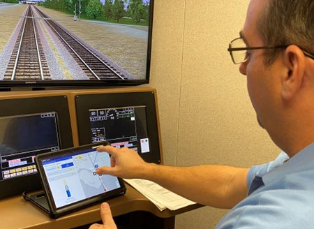
Field crews juggled 5 to 7 apps. One role-based platform, launched on tablets during COVID. Access time cut from 24+ hours to the same day, with 40% fewer credential calls.
Read the case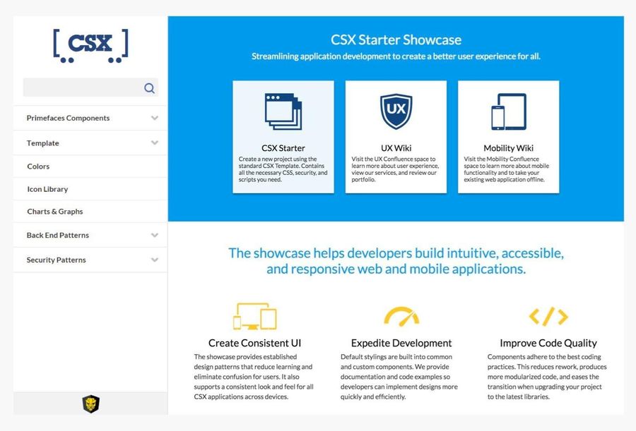
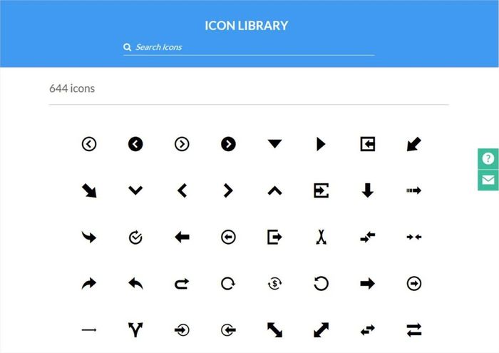
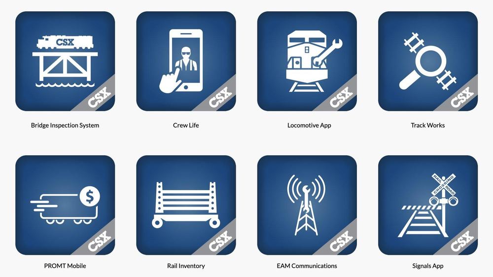
600+ icons, 30+ app icons standardized, and new engineers productive on day one instead of two weeks in.
Read the case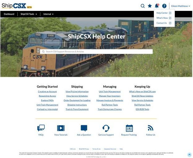
A 25-field first contact, 44% drop-off after a single FAQ page, and a help system rebuilt around what customers came to do.
Read the caseOne cross-pillar strategy for how members grow their networks. A double-digit lift in member-to-member follows and more engaged feed sessions.
Read the caseAward of Excellence in Public Safety · NAPSG Foundation
As the UX leader, my team was tasked with taking over the initiative from a third-party vendor. We brought clarity, untangled the complexity, put a clear process in place, and saved time and money, delivering an award-winning application.
Gives first responders near-real-time contents of any rail car on a CSX train, with emergency response guidance and protective action distances, on any phone, tablet, or desktop.
“A dream come true for incident commanders.”Former Battalion Chief, Charlottesville Fire Department
Built teams from zero, ran portfolios of hundreds of applications, and led designers, engineers, and product managers from strategy to release.
A roadmap only matters if it ships, so every engagement runs from executive alignment to the delivery plan to the release.
Design systems, governance, career ladders, and operating rhythms are what let quality scale past any one person.
Teams of designers, engineers, and product managers who own decisions, raise the bar, and keep raising it.
Enterprise scale or early stage: building the first design team, standing up 0-to-1 products, or bringing order to a sprawling portfolio.
See the operating model
Short pieces on design, product, and leading through change.
Why the best product outcomes start with design and product shaping the bet together.
ReadBuilding a Center of Excellence from zero inside a 1,000-application environment.
ReadData choices, onboarding, and what changed after the first ramp of an AI launch.
ReadAbout
Design and product leader across enterprise platforms, consumer products, and executive consulting. Builds the teams, systems, and operating rhythms that turn complex technology into products people trust.
More about KarynLinkedIn Recruiter · Generative AI · 0 to 1
Recruiters were spending hours researching candidates and rewriting the same outreach. The bet was that AI could do the personalization at scale without sounding generic. I led the design team that took it from first concept to a live pilot.
Pilot results
higher acceptance for AI-assisted InMails than standard single messages
faster time to acceptance
more accepted InMails with automated follow-ups
of generated messages rated good in product
Adoption: 75% of pilot contracts and 25% of seats tried the feature, and 16% of single, non-templated InMails from pilot customers used AI-generated content.
Inside the work. These are working artifacts from the build: explorations, review rounds, and iterations on the way to launch. They're shown to make the decisions visible, not just the final pixels. Product screens are illustrative recreations; the originals are confidential.
01 StrategyThe bet
Recruiters told us the same three things: researching each candidate took too long, staying on brand was hard, and personalizing at scale was nearly impossible. Before designing anything, we ran foundational research to find where AI would actually earn its place.
The quality of the output depended on what we fed it. I partnered with Data Science, Product, and Marketing to decide which data should shape a message, starting from what recruiters already trusted: their own saved templates, the candidate's profile, job details, and company information. We validated output quality against sandbox data before committing to the final approach.
Because this was the first generative AI experience in Recruiter, we designed it as a pattern that could scale to later releases, not a one-off feature.
02 ExecutionHow it shipped
Every design decision had a clear path to a decision-maker. I owned the quarterly design planning cycle with cross-functional partners and set the review cadence for the team.
Components we needed were changing during the build. We worked with the design system team to stabilize what the launch depended on, built on mature components, and planned the larger Recruiter update separately so the launch didn't wait on it.
AI-generated content needed clear disclosure. We designed it to inform recruiters without interrupting their flow, then used post-launch data to simplify the experience and remove the banner.
03 The experienceWhat recruiters do
Select a step to walk through the shipped flow.
The recruiter opens a new message to a candidate from search or a project pipeline.
Illustrative recreation of the shipped experience.
04 IterationAfter the first ramp
The first ramp showed recruiters weren't finding the feature. The value was there once they used it; the entry point was the problem. We reworked onboarding before expanding.
Illustrative recreation of internal iterations.
Customer voice
“This helped me send detailed personal emails to candidates and save time. I am so glad you created this!”Pilot customer, in-product feedback
“I really appreciate the AI feature especially for those who may have trouble typing for someone like myself.”Pilot customer, in-product feedback
“It saves time by letting the Recruiter create a customizable message that can be sent to candidates quickly.”Pilot customer, in-product feedback
In the press
My team designed and launched the first phase in 2022. LinkedIn continued to evolve and expand the experience, with public coverage as it grew.
05 ImpactWhat it changed
The launch proved recruiters would adopt AI when it personalized their own work rather than replacing it. The data foundation, the onboarding pattern, and the cross-functional review model laid the groundwork for how the experience expanded.
CSX · UX Strategy · Role-based experience
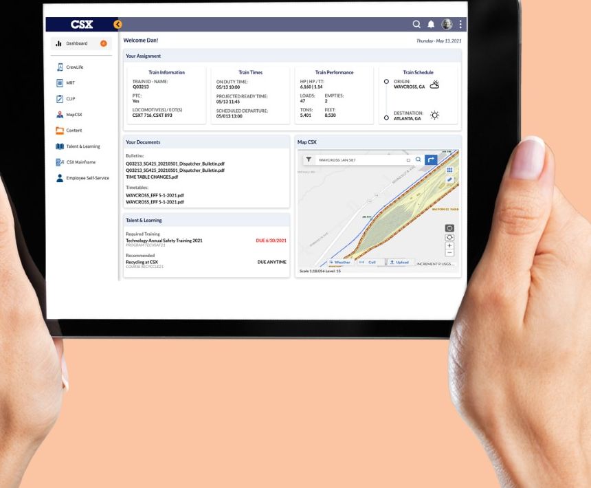
Decades of mergers left train and engine crews switching between five to seven applications to do one job, with access granted by hand. I led the strategy and delivery of a single role-based experience that put each worker's tools, documents, and data in one place.
Results
access for new and reassigned workers, down from 24+ hours
fewer calls checking credentials and training in the first 3 months
separate apps per task consolidated into one role-based view
first release on tablets, under COVID physical distancing rules
Inside the work. These are working artifacts from discovery through launch: field research, concept screens, and the before and after. They're shown to make the decisions visible, not just the final pixels.
01 StrategyThe bet
Every acquisition had added its own tools. Field workers lost time hunting across systems, several apps had never been brought up to our UX standards, and onboarding meant requesting access one application at a time. The fix wasn't another app. It was a different model: start from what a person in a given role needs to do their job, and assemble the experience around that.
The role-based access model did more than simplify sign-on. Working with Security and the Chief Architect, we designed how authentication tokens and user profile data would be governed by role. That gave the data science team a trustworthy foundation for using machine learning to personalize the experience later.
We used design thinking and the double diamond, and began with the field: site visits, shadowing, contextual interviews, and prototype reviews with train and engine crews. Their constraints set the requirements: gloves, glare, connectivity, and minutes between tasks.
Six principles guided every screen.
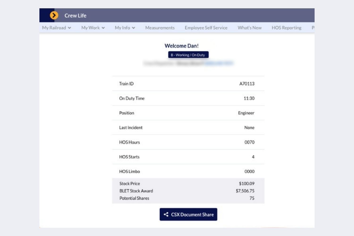
Before and after · drag to compare
 BeforeAfter
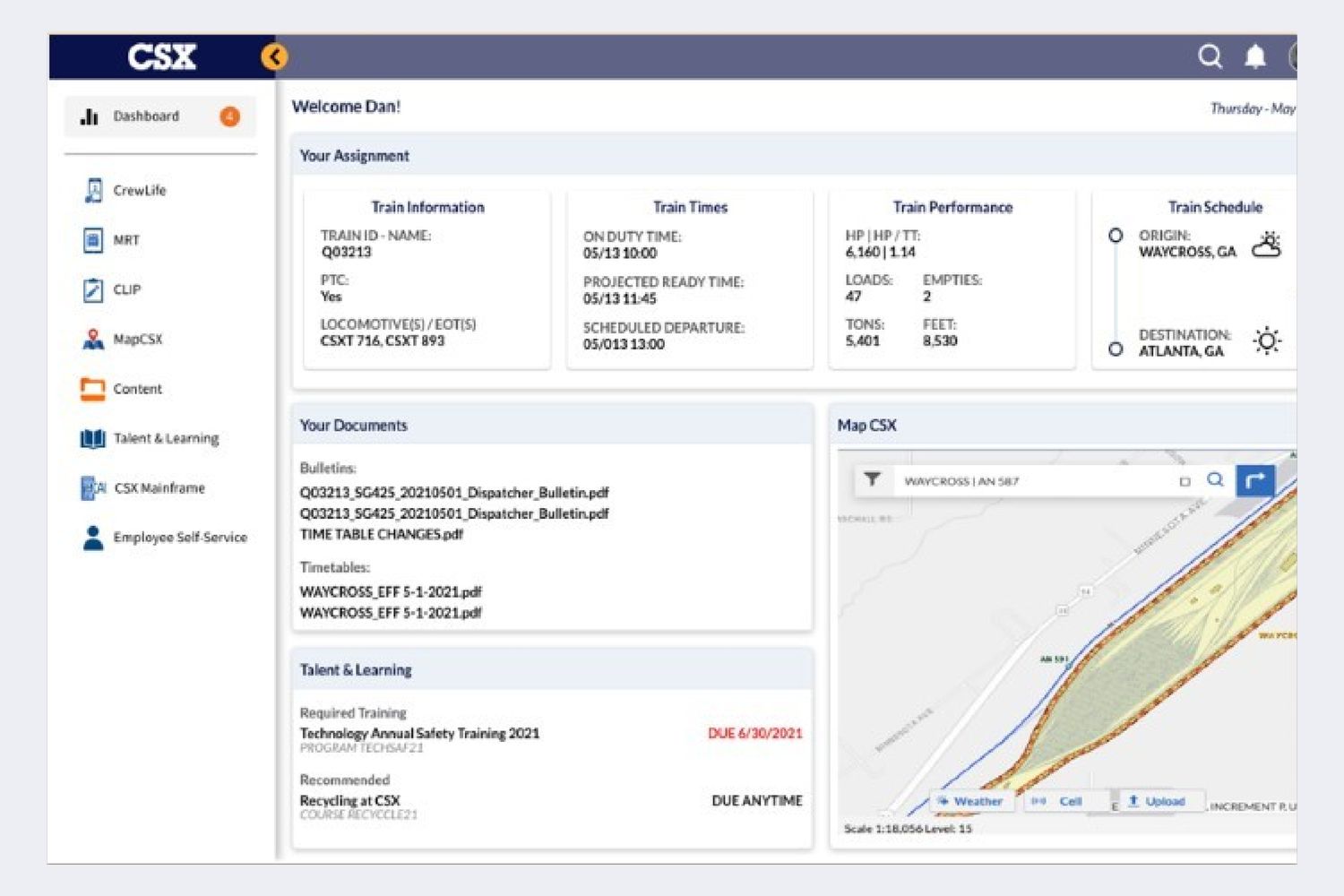
The legacy crew app showed a list of fields. The new view brings the assignment, train times and performance, documents, required training, and a live map into one screen. Personal details are blurred.
02 ExecutionHow it shipped
Federal rail rules required physical distancing, and crews needed information without crowding into shared workspaces. We shortened the design cycle and launched the first release on tablets for train and engine crews in 2020.
To keep the platform from fragmenting again, we set up a single intake with a defined path for each type of work.
Crews needed bulletins and timetables in the field, but the existing PDF viewer couldn't meet security requirements on tablets. I worked with the Chief Architect, Security, and our UI architect to design and implement a secure way to view documents on the device.
03 ImpactWhat it changed
The work also shaped what came next: a scalable design system for future needs, and a move toward smaller, composable micro-apps instead of large monolithic applications.
CSX · Design Systems · Developer tools
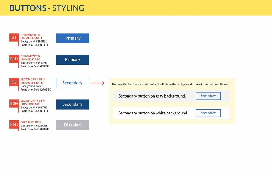
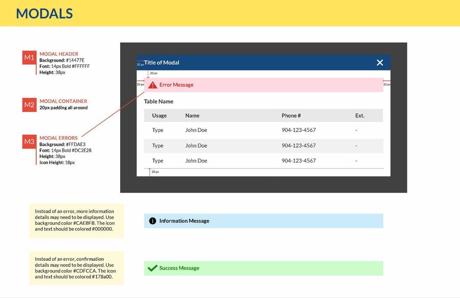
CSX hired me to build a design system that could scale across its applications. Over seven years it grew from a component library into the foundation for how the company designed and built software, and the role grew into leading Digital Experience.
Results
new engineers productive immediately instead of two weeks of setup
searchable icons with metadata in one library
enterprise app icons rebuilt on one template
source of truth for patterns, code, and documentation
01 StrategyThe problem
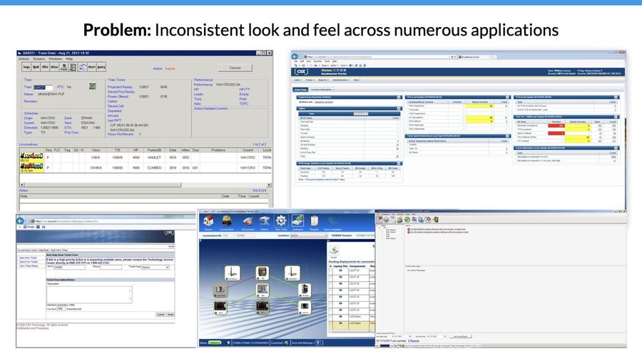
Applications inherited through mergers looked and behaved differently, from search to navigation to labels. Rail employees who moved between several apps a day carried the cost in confusion and slower work. Developers carried it too, copying outdated code or inventing patterns because there was no standard to build on.
02 ExecutionHow it was built
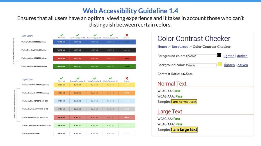
Components as the basic building blocks, modules that combine them into working sections, and page templates for common layouts. The UX team also built custom modules for needs unique to rail, like a train route visualization.
03 ImpactWhat it changed
A senior project manager who had always budgeted two weeks of startup time for new team members reported they could start immediately. Engineers saw the same effect in their own work.
“Using the Showcase drastically lowered the development time.”Software Engineer, CSX
CSX · Customer Experience · CSX.com and ShipCSX
For a prospective shipper, CSX.com was the first impression of the company, and it asked them to do the heavy lifting. I led the experience strategy to make the site easier to find, easier to act on, and clearer about why to choose CSX.
Inside the work. This is the diagnosis and the strategy: what we found, what we recommended, and the concepts that set direction for the rebuild.
01 StrategyThe diagnosis
Before recommending anything, we mapped business objectives against customer goals: stakeholder interviews to set the objectives, customer interviews to understand expectations, an expert review for usability problems, and a competitive analysis to see where CSX stood.
What analytics showed on FAQ pages
Redrawn from site analytics, October to December 2020.
02 ExecutionThe plan
03 ImpactWhat it set up
LinkedIn · Network Growth · Cross-pillar strategy
I led the Network Growth design team, which helped members create, engage with, and grow their networks. One strategy I led made Follow a first-class way to build a network, coordinated across every pillar that touched it.
Results
increase in total follows
more visibility for followable members from larger recommendation cards
lift in member-to-member follows
more engaged feed sessions
Inside the work. The original designs are confidential, so every product visual here is an illustrative recreation of the concept, not the shipped screen.
01 StrategyThe bet
Connection requests frustrated both senders and recipients, and many members didn't see the value of simply following someone. The strategy was to make Follow an easy, valuable first step: a way to learn from people before, or instead of, connecting with them.
Creators could make Follow the primary button on their profile. Members could keep up with someone's ideas without the weight of a connection request, and creators could reach people who wanted to hear from them.
Illustrative recreation.
Each pillar designed for a real reason a member would follow someone.
A member reacts to a post on a topic the member cares about, and is offered more creators who write about it.
A member visiting a creator's profile follows the creator, subscribes to the creator's newsletter, and sees related people to follow.
A member searching a topic finds experts and creators to follow, and content that matches what the member is learning.
Illustrative recreations of the concepts. Topic-first recommendations used what a member was already engaging with to suggest who to follow.
02 ExecutionHow it shipped
Each pillar had its own ideas and its own resource limits. We mapped a shared roadmap with the product team, organized every use case in Figma for easy review, led specific pillar teams directly, and ran design jams with product and design leaders to keep alignment.
Product wanted fast approvals, and early use cases lacked detail. I worked with the product manager to reorganize design sprints so the team had room to explore and product delivered detailed use cases on time.
03 ImpactWhat it changed
Leadership
My job is to align a team's work with what the organization needs, make sure everyone can see how their work adds value, and then get it shipped. The teams I lead are built on open communication, mutual respect, and steady improvement.
The same four disciplines, whether the team is eight people or a center of excellence.
Planning and checkpoints on strategy, funding, and OKRs. Resource planning and staffing forecasts, and clear priorities across business partners competing for the same team.
Executive steering committees, including standing up new ones and choosing the right stakeholders where none existed. Created business cases that secured funding for initiatives worth millions.
A predictable review cadence of critiques, design reviews, show-and-tells, and executive reviews.
Hiring, career ladders, and promotion business cases for direct reports. Mentorship, coaching, and programs that keep people learning from each other.
Remote, onsite, and hybrid teams across design, engineering, product, and program management.
CultureWhat I build around the work
Working agreementHow the team works together
At IBM, my team wrote a working agreement the same way we'd run a session with a client. Three commitments held it together.
Honest and respectful. We give feedback constructively and listen to each other's opinions.
Curious and always learning. We share experiences early and often, including what didn't work.
Clarity with each other, respect for each other's time, and room for every voice.
PeopleManaging individuals
“People will forget what you said, people will forget what you did, but people will never forget how you made them feel.”Maya Angelou
About
Design and product executive with a portfolio and program management foundation. Builds the teams, systems, and operating rhythms that turn complex technology into products people trust, across enterprise platforms, consumer products, and executive consulting.
In many organizations, design shows up after the bet is made. Leadership picks the market, product writes the requirements, and design is asked to make it work.
By then, the most important decisions are locked in.
When I started building the Digital Experience team at CSX, there was no formal product function yet. Design did that work by necessity: framing problems, deciding what to sunset or rebuild across more than a thousand applications, and helping partners build the business cases they took to their C-suite.
At IBM, I led design thinking sessions with C-suite clients in healthcare and government. The decisions about what to build were made in those rooms, with design leading the conversation.
The earlier design is involved, the more cost-effective every great decision becomes.
Evidence from real users before money is committed. Tradeoffs made visible while they're still inexpensive to change.
Design also checks early whether the work can actually be delivered, because good design leaders think about systems, teams, and rollout, not just pixels.
Put design leadership in the planning cycle, not just the delivery cycle. Give design a seat on the steering committees where priorities get set.
Measure design by outcomes. Use Jobs to be Done to ground the work in research, Google's HEART to track the experience, and growth metrics like retention or a North Star metric to show business impact. That keeps the conversation on adoption and growth, the numbers that drive revenue, and not only on taste.
Bringing design to the strategy table brings the customer with it.
That's how products earn loyalty, and how loyalty becomes revenue.
When I joined CSX, the design team was one contract designer and me. The application portfolio ran more than a thousand systems deep, built up over decades of mergers.
People often assume a legacy environment is the obstacle. In my experience, the obstacle is the absence of a system and governance for making decisions.
Small, visible quick wins created the support to hire, and then to expand. Executives fund results they can see.
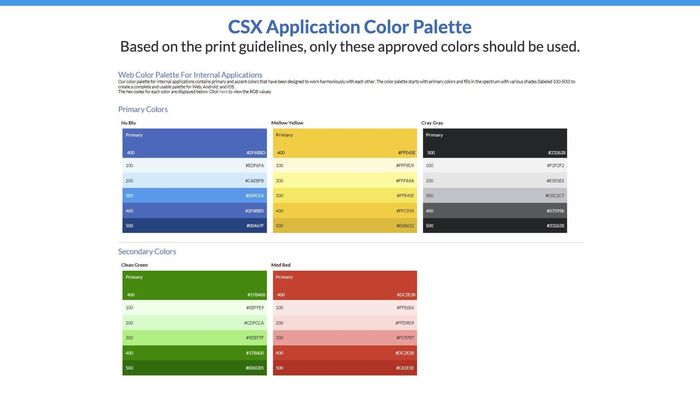
We built the foundation first: shared components, an accessible color palette, a searchable icon library, and code developers could use directly.
A standard lets ten people move like one team.
Through UX University and Dev University, we ran multiple sessions for hundreds of technical and non-technical employees. People who understand the system defend it for you.
Governance works when people want to be part of it.
A contribution process let teams propose changes, and executive steering committees made the hard calls. Where no committee existed, we chose the right stakeholders and stood one up.
With the system in place, we could decide across the whole portfolio what to sunset, what to revamp, and what to rebuild around the roles people actually do.
We cross-trained so no one person held critical knowledge alone, and brought UX into customer forums so the people we served could shape the work.
A legacy enterprise can move fast. It needs a system that makes good decisions repeatable.
When my team designed the first generative AI experience in LinkedIn Recruiter, the technology was the exciting part. The hard part was earning the trust of recruiters who would put their name on every message it helped write.
We assumed recruiters wanted to write faster. Research showed the real pain was personalization at scale, and a worry that AI outreach would sound generic.
That reframed the product around relevance.
We started with what recruiters already relied on: their saved templates, the candidate's profile, the job details, and company information. We validated output against sandbox data before committing.
People trust AI that makes their work better and leaves the judgment to them.
Recruiters chose what to personalize, edited every draft in their own voice, and saved the best ones as templates for their team. Control is how trust gets built.
We designed disclosure to inform without interrupting, then used real usage data after launch to simplify it.
Recruiters who used the feature valued it, but many weren't finding it. We changed onboarding before expanding: it appeared as soon as the composer opened, with a persistent entry point in the toolbar.
Trust comes from relevance, control, and transparency, designed in from the first decision.